Page 1 of 2
Warrior 4 Jesus' Art
PostPosted: Fri Jan 21, 2005 4:57 pm
by Warrior 4 Jesus
(I think I've worked out Photobucket. I know this is in the wrong part of the forum but thumbnails don't seem to work for me in the Gallery as attachments so I'm just posting them here. If a mod could move them to the Original Artwork part of the gallery that would be great, Thanks!)
Here are are some book covers I'm working on for the novel I'm writing called: Before the Dawn, (refering to the saying: it's always darkest before the dawn.)
I haven't drawn in the last two months at all, even though I love to draw (love reading too much!), so this looks pretty good to me.
I drew it in HB pencil, scanned it, cleaned it up a little in photoshop. Took about 1 and a half hours! (Think it turned out better than normal because I usually like to draw quickly).
The first image is of the 1st design for the cover.
The second image is of the 2nd design for the cover.
Which do you like better and why? I personally like the 1st design better because its cropped and the second one I tried drawing the other side of his face and it didn't work out so I flipped it and modified it on the computer.
Please give constructive criticism and tell me if the nose, eyes, mouth whatever are in the wrong place, look wrong, wrong size, wrong placement of graphics etc...
I was inspired by an earlier drawing of mine and the shoulder armour pattern is inspired by leaves. I used a very basic skeleton drawing as reference for body proportions. Its all originally from my warped mind.
I think I'm improving in my drawing though, which is a good sign. Please critque so I can get better!
Thanks!
(these links work but I'll be much abliged if someone could step me through the pic attachment Photobucket process)
http://img.photobucket.com/albums/v281/CJesky/front_cover1.jpg
http://img.photobucket.com/albums/v281/CJesky/front_cover1a.jpg
After some consideration I may use the first design but move the face across to the left more so you see a little of the other side of his face.
PostPosted: Fri Jan 21, 2005 6:35 pm
by Esoteric
I agree. I like the first one more. The half-cropped face is more mysterious (we only get half the picture). I also like the positioning of the scythe shadow more. In the first one, it's distinct. At first glance I thought it was some strange sword handle (it's in the right place). THe way it overlaps behind his head in the second one seems less planned and less visually effective.
PostPosted: Fri Jan 21, 2005 7:20 pm
by Warrior 4 Jesus
Thanks! What about this: I may use the first design but move the face across to the left more so you see a little of the other side of his face.
http://img.photobucket.com/albums/v281/CJesky/finalcover_web.jpg
Also what about the placement of the title? What about leaving the upset guy and his scythe shadow out all together? I want to keep it but mum says it conflicts with the image a little. What do you think of that idea or just leave it as is?
Thanks once again!
PostPosted: Fri Jan 21, 2005 9:29 pm
by That Dude
Nice work W4J. I think that your mom is right. The scythe shadow is cool but it works better without it. Since you asked for constructive critisism I give you a little bit. The guy looks a little girly because his top lip is to large. If you lowered it about halfway between his open mouth and where it is now it'd look better and manlier and all that. Nice work though! I'll be looking forward to more.
PostPosted: Fri Jan 21, 2005 10:27 pm
by Warrior 4 Jesus
Thanks! I've changed it.
PostPosted: Sat Jan 22, 2005 5:21 am
by girlninja
NIce work 4W yea i like the half croped face as well ^^ it looks really good kinda like a mix betweeen realism and anime ^^ at least i think so very very nice! ^^ heh no cricism on this end lol not that i'm equipped enough to give any

PostPosted: Sat Jan 22, 2005 6:21 pm
by That Dude
Nice. Looks better. So your gonna color it right?
PostPosted: Sat Jan 22, 2005 8:22 pm
by Warrior 4 Jesus
Uh.. could a mod please delete this post. My computer's stuffing up.
PostPosted: Sat Jan 22, 2005 11:08 pm
by Warrior 4 Jesus
(computer now working better (delete above post please)
That Dude, yes, I'll colour it but it may be awhile in the meantime I'm just drawing some more stuff.
My next piece. The quane (pronounced qwain) This is a bird I created for my story. It pulls the carriages of the scorcerists (scorcerers who use science for evil purposes). The bird's are around 3 metres high and very fast.
Inspired by the ibis bird and the giant moa of New Zealand.
HB pencil - 1 hour?
http://img.photobucket.com/albums/v281/CJesky/quane.jpg
PostPosted: Sun Jan 23, 2005 11:00 am
by CreatureArt
I like the revised version of your book title best. Very cool. I did like the guy with the shadow in the background - but I agree that it did take emphasis from the main character out in front.
I like the quane. Hurrah for moas! The texture on the body is great - very much like the real moa.
PostPosted: Sun Jan 23, 2005 12:57 pm
by soul alive
nice drawings for the book cover; personally, i like the half view or 3/4 view of the face best. maybe, try drawing the guy and shadow very lightly to force it more into the background. how you color it could affect it as well, like if you color the guy in front in color, and the guy and shadow in black and white, or something like that... just a thought, though.
love the detailing on the bird, it has an almost sinister look about it, which suits it and what it is used for.
looking forward to seeing more.
PostPosted: Sun Jan 23, 2005 2:13 pm
by Warrior 4 Jesus
Thanks everyone! As for the man and his shadow in the background I've decided I won't have that on the front cover but as a seperate illustration in my novel.
I'll put up more art when I've done some. But for now here is some stuff I did last year.
Me wielding the (1st version) of the Sword of the Spirit (called the Spirit Sword in my story) I'm not a character in my story but I thought it would be fun to draw myself like this. I made a cardboard sword and stood in that pose. Then I ask my bro to take a shot of me with the digital camera and I used the photo as reference for the pose.
HB pencil, Artline 0.4 pen. 1 Hour
http://img.photobucket.com/albums/v281/CJesky/me.jpg
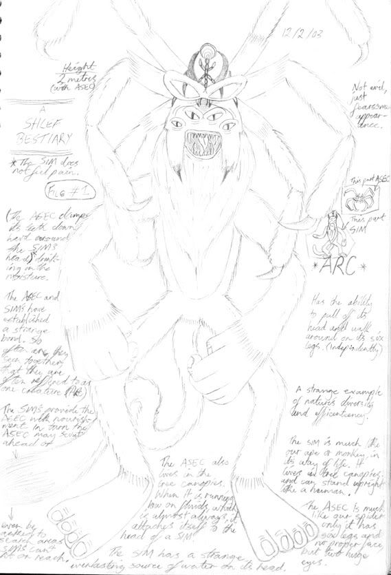
Someone at TAFE was talking about spider monkeys and so my imagination was stimulated and I came up with this. (Sorry about the faint lines, if you zoom in you should be able to read a little about the creature).
HB pencil
http://img.photobucket.com/albums/v281/CJesky/arc.jpg
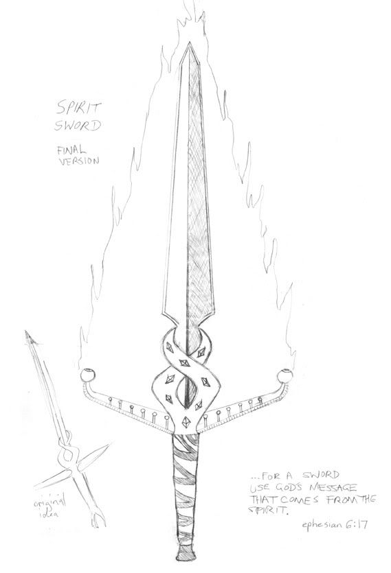
My final version of the Spirit Sword. The Sword sometimes produces Flame (The Fire of God). The little thumbnail in the corner is the idea and the larger image is the final. Few days before I did this I had finished drawing someone playing a guitar. So I had the image of a guitar in my head and it inspired the drawing. I really like the look of this sword. Hopefully it looks fairly original.
HB pencil
http://img.photobucket.com/albums/v281/CJesky/sword.jpg
PostPosted: Sun Jan 23, 2005 3:43 pm
by That Dude
Nice stuff. I wasn't pressing you about the coloring...It's one of my least favorite things. I was just wondering. Hey you might want to make the head of the bird a little bigger. It'll look more perporsional. (sp?) It is a cool looking head though. I take it you like broadswords?
PostPosted: Sun Jan 23, 2005 7:24 pm
by CreatureArt
I like your new pictures, too. The one of you holding the sword is cool - I love the linework. The Spirit sword is awesome, too - I love the design for it and the inspiration, too

. I liked the spider-monkey, too - it looked cool.
The idea of a spider crossed with a monkey made me laugh, though. Actually, monkeys often make me laugh - so it might not have anything to do with the spider...

Awesome stuff - can't wait to see some more
PostPosted: Mon Feb 21, 2005 12:23 pm
by Photosoph
Inspired by the ibis bird and the giant moa of New Zealand.
MOA?!!! *goes crazy* I love moas! Oh, and I think I remembered you asking if we had ibis in NZ in other post... actually, I don't think so, or at least they're not common in the area where I live.
Hmm... of the first two pictures, I could have to say I like the first one best. I agree with Esoteric: the half-cropped face is more mysterious. My only critique would be that from the half-cropped picture it's a little hard to tell if the line above his mouth is a moustache or a top lip -but I think if this is coloured that issue would disappear.
Excellent drawing Warrior! I love the way you draw people -and I have to say that the leaf pattern looks great.
I think it looks even better how you've got the cover showing more of his face. His form frames the title well. One thing I was wondering, about the shadow and sythe bit... maybe if you had the boy above and to the left of the writing, and the shadow going under the writing with the more distinct featuers of the scythe and waist-up a little below the actual words, how would that look? Only thing is you might have to resize/redraw to see how that would look.
Wow! The texture on your quane is great! It really looks like the hairy sort of feathers moa and kiwi have. Excellent!
I really like the one of you holding the sword! Great expression.
Lol, spider monkeys... *grabs Dude's avatar and adds spider legs*
The last pic of the spirit sword looks AMAZING. I love it! I find weapons hard to draw, but I think they're also really interesting... I love the detail on its handle and the way you've drawn the blade. I'm really impressed because a lot of swords I've seen seem to lack both an original handle (I forgot what that thing is actually called...
) and the blade is very much just a pointy nothing. But your blade looks very cool. I love the way you've formed this formidable weapon!
*pulls out spirit sword. "Shink!"*
Heh heh, this long post is just to make up for the amount of time I didn't realise this thread was here. ^_^
PostPosted: Mon Feb 21, 2005 12:45 pm
by That Dude
Sorry to inform you Photosoph...But my avatar is a neko (cat person.) I just put monkey boy 7.0 under it to throw everyone off

(I've been called monkey boy before during a missions trip because the way I was climbing through the rafters of the building we were putting up.) But if you add a small monkey body to your av it could be a "golden lion tamerine!" Which is a small monkey...Well anyway I'll be looking forward to some more stuff W4J.
PostPosted: Tue Feb 22, 2005 1:18 pm
by Photosoph
Golden lion tamerine! *grins* Well, maybe not... but it's a cool idea.
At first I thought your av looked like a neko, but then I looked at 'Monkey boy 7.0' and got confused. ^_^
PostPosted: Tue Feb 22, 2005 8:03 pm
by girlninja
*comforts photo
*Wink
hehe like the art ^_^ is that one pic you did on your last post...the char in your story...did you draw that on paper...or did you do that on paint cuz it looks almost like that type of program ^_^ love it *not trying to say its not awesome* but i was wondering how you got some of the affect you did if it was in pencil ^_^ heh i have trouble with inking and it looked really clean so lol ^^ i'm a sketchy line person ><
PostPosted: Tue Feb 22, 2005 8:11 pm
by Warrior 4 Jesus
Hi girlninja,
Thanks for the kind comments. The character with the sword (is that what you mean?) from my story is drawn on plain paper. Just with HB pencil and outlined in 0.4 Artline felt-tip pen. Its not inked in any special way, I did a good job of erasing the pencil lines that's all. I guess from my background of loving to draw cartoon style has enabled me to draw clean lines. The only downside of this is I often had to start over again if I made a mistake. I'm starting to draw better and I am learning how to sketch a little. But I have a long way to go. That's why I need to keep on practicing!
PostPosted: Wed Feb 23, 2005 10:56 am
by girlninja
heh i hear ya ^^ ;;;; i think i'm ten years behind most of the artists on here ^_^ ;;;;;
PostPosted: Sun Mar 27, 2005 11:14 pm
by Warrior 4 Jesus
Sorry about the long wait.
My first attempt at digital art. I don't have a clue how/what brushes etc to use in Photoshop so could someone give me a little help?
The creature is another flightless bird. This time I haven't got a name for it.
http://img.photobucket.com/albums/v281/CJesky/quanebaby6.gif
My first animation ever - how Tintin recieved his hairstyle (referred to Tintin in the Land of the Soviets and used lots of imagination).

Enjoy!
PostPosted: Mon Mar 28, 2005 2:33 am
by CreatureArt
Hurray! I'm glad to see some more art, Warrior. It looks good.

The animation looks excellent.

- so THAT'S how it happened. I'd always wondered. You've captured Tintin perfectly - it looks very good.
The quane baby looks awesome too - I like it's furry texture. It's - is halter the right word - looks cool, too.
I'm not sure what type of photoshop you have but I'll try and help with the brushes problem. I don't know how long you've been using photoshop so I'll try to cover some of the basics as well, sorry if you already know them. You might also have a different version of photoshop, but I'm hoping this same method works in most versions.
Usually I would go into the brush tool (b is the shortcut). Up the top, immediately under the File, Edit, Image, Layer etc. menu bar you should see another menu bar with brush options.
You will a picture of a brush with a down-pointing triangle at the start of the menu. Go to the next one, which is a word
Brush: with a little preview of your current selected brush shape and another flipped triangle.
If you press that triangle you should get a drop-down list of different brush shapes, with a slider bar up the top which says
Master Diameter. You will use that slider to increase/decrease the size of your paint brush shape.
Those first shapes will give you a crisp, sharp line that I find really good for linework. If you go a little further down you'll see brush shapes that look blurred - good for soft edges. Even further down, you should find some odd ones that look like grass/fur, maple leaves etc. Those grass/fur brushes are really excellent for a simple furry texture.
I hope that helped somewhat. To get back on topic: Your pictures look awesome and I hope you continue to explore the digital media.
PostPosted: Wed Mar 30, 2005 1:01 pm
by Photosoph
Lol! Excellent animation, W4J!
That bird is so cool! I love big feet with chunky toes. I also really like your texture, and especially the distinction between the metal and the hairy feathers, and the way you've got the bottom of his feet as well as the bottom of his beak and toes looking softer compared to the metal. <Not sure if that fully explains what I want to say, but it'll have to do. ^_^
PostPosted: Tue Apr 05, 2005 8:17 am
by That Dude
Love the Tintin animation W4J! Yeah what CreatureArt said is true. You captured him perfectly.
PostPosted: Tue Jun 28, 2005 7:46 pm
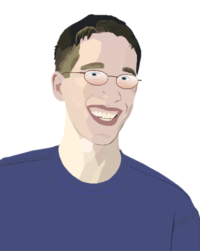
by Warrior 4 Jesus
A pic of me I did in Freehand for Graphic Design course. Took many hours but I think it looks like me. (Why is it that the pic pixelates so much when I imported it into Photoshop?) Comments welcome.
PostPosted: Tue Jun 28, 2005 8:04 pm
by Photosoph
Il y a un autre image! There's another pic!
That's so cool. I love this style of picture, but haven't managed to do a pic in this style myself. Personally, I love how its almost on the line between cartoon and photo-realistic. That's amazing, W4J; if you can't tell from the above ramble, I really like this pic, and this style of drawing! Really well done. ^_^
PostPosted: Tue Jun 28, 2005 8:06 pm
by Warrior 4 Jesus
Thanks Photosoph!
Once its printed out the picture and the colours blend a lot more naturally. Its not quite as hard lined edges.
PostPosted: Tue Jun 28, 2005 11:09 pm
by CreatureArt
Whoa - that's an amazing picture! Even though you said that it blends a bit more when its printed out, I really like the hard edges - it gives it a nice stylistic quality. Very, very cool.
PostPosted: Mon Jul 04, 2005 3:33 pm
by HikariChan
Thats awesome:thumb:
PostPosted: Sat Jul 16, 2005 11:49 pm
by Maledicte
seems I'm a bit late...>.>
I couldn't access your cover pics, so I can't comment on them. However...
Quane: great concept, I'm a fan of birds, real or fictional. Great texture on the body. However if the foot were moved back (made smaller) or the head moved forward (made bigger) it would give the picture some depth.
self portrait with sword: I like this one. Very clean and simple, almost animation-like. I like the sword especially. *needs to learn how to draw swords that look simple yet sophisticated at the same time...urgh*
The spider-beast-monkey...thing: now THAT....is original. looks far better than my attempts to draw a spider-furry beast hybrid, and believe me, I've tried. Taking me a lot of strength not to steal it.

Sword: lovely. Just lovely. I love the little markings on the crossguard.
quane-baby: I'll admit, I like this better than the first quane.
Animation: I can't animate at all, so....goooooooooooooooo W4J!
self-portrait: *jaw hits floor* wow. just....cool. I have no critiquing whatsoever on this one. Dude.